“That” - a minimalist take on todo lists & reminders
People who know me are very much aware of the fact that I have an affinity for todo lists, there are some amazing apps out there that help you create and maintain them, but there are times when I'm simply too lazy to add items to my list or think that this is so important I definitely don't need to write it down, it'll be the first thing on my mind.. except I often end up forgetting it.
I wanted to create a todo list that was meant for that one most important task of the day, took very little effort to set up and in return made sure that you don't forget about it.
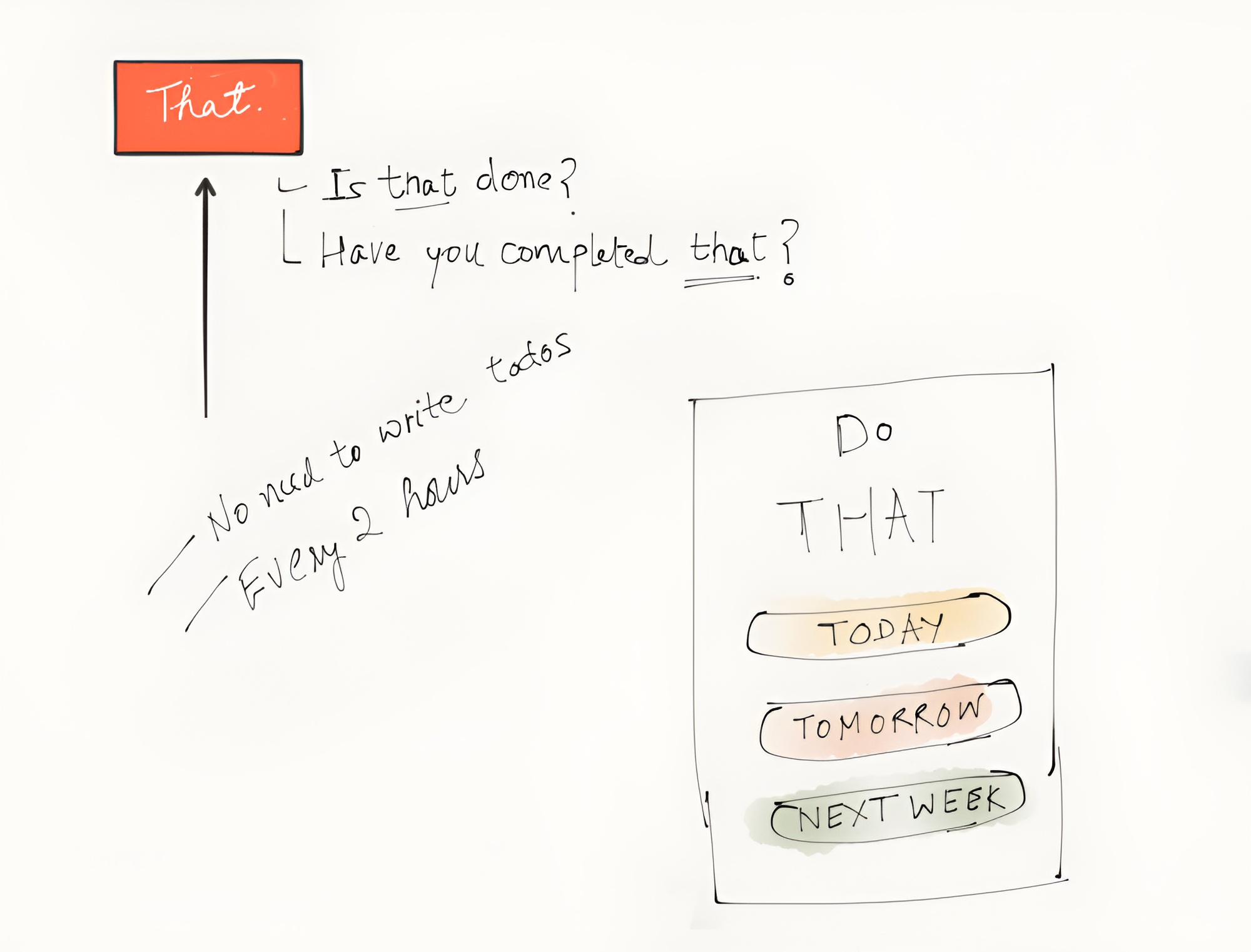
I took away everything from what a generic todo list would have and left only what matters the most in the end which is whether you complete the task or not.
Since it's the most important task for the day the chances of forgetting what it was are minimal as long as someone's there to remind you about it, so you don't essentially have to write it down, which means one less action for you to perform in the app, that's great!
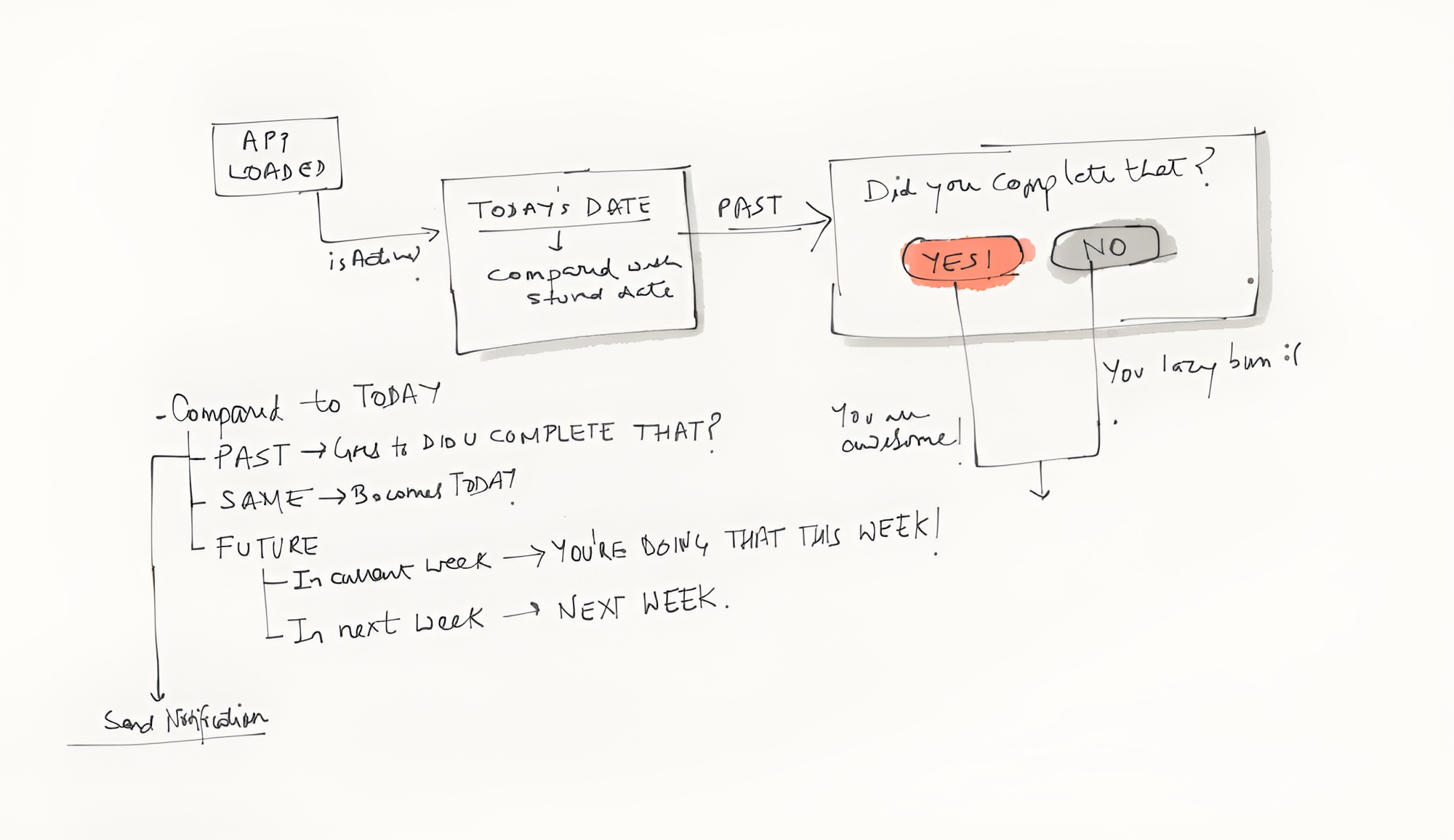
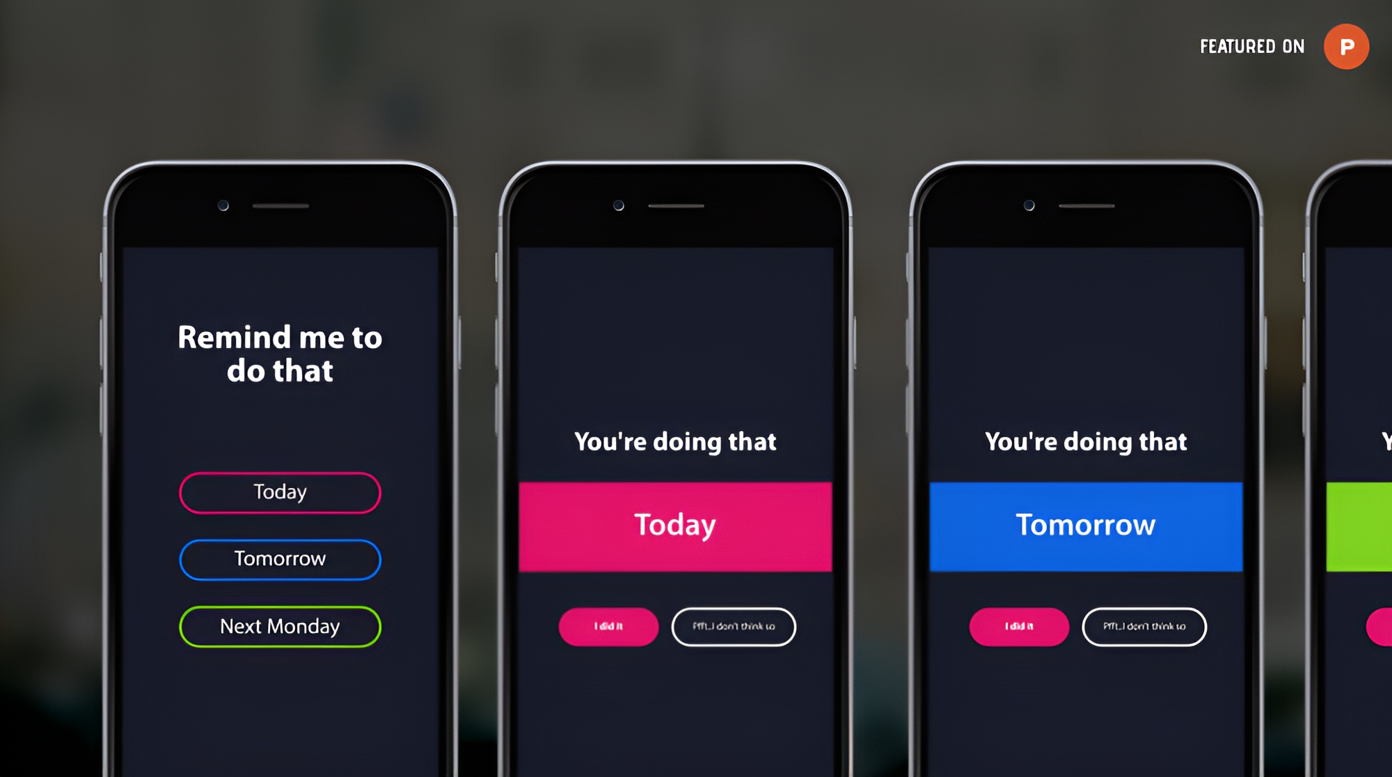
I ended up with a minimal interface that gives the users 3 options to choose from for setting their reminders, choose a day and you're all set, “That” will remind you via notifications about the task at hand on the day it is due.
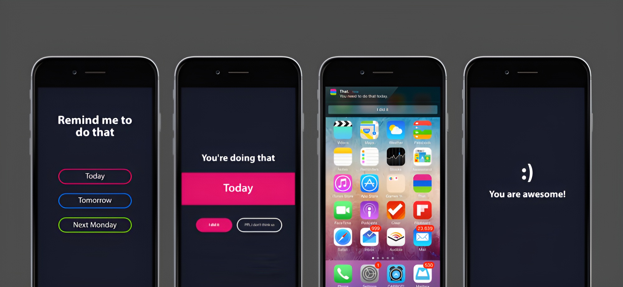
And that's it! “That” basically solved the problem for me, now when something of great importance is due I leave it to “That” which does a great job at making sure I don't miss it.
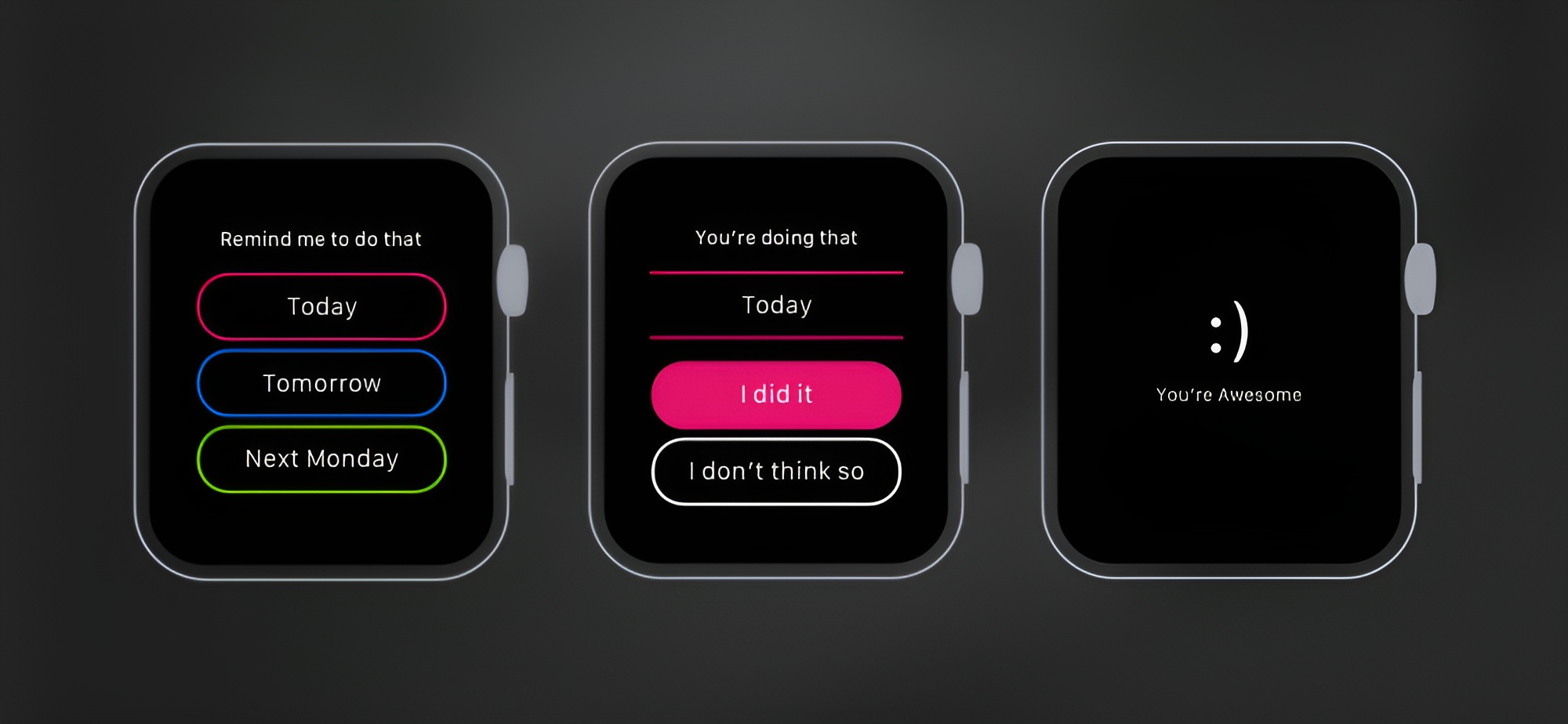
I also explored an Apple Watch app concept.
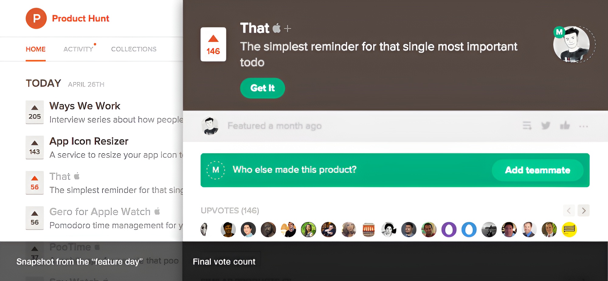
“That” was featured on the Product Hunt home page as the "Product of the day" shortly after it went live on the App Store, this made me realize that this was a problem that many people had and I'm happy that I could help them solve it :).
